I meant,
If you have the time, energy, and desire
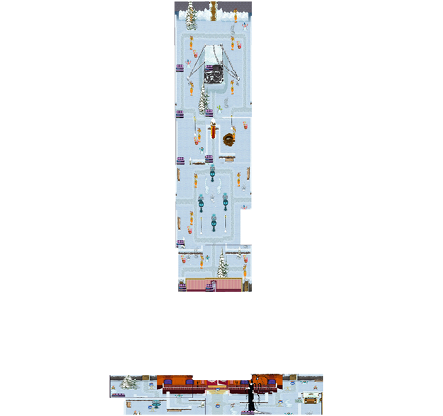
Your maps would look a lot more profesional if:
you retake some of the screenshots,
fit them together a bit better, this may be easier to do if you use a Transparent Backround instead of White or Black (but it all depends of your image type) I am not a graphic designer so these are just sugestions.
For instance glue the picute of the Front and backyard together with the side yards, here is a sample: (I skiped the side yards and used your images.)
the transparency makes it easier to fit the pieces together, and it also allows for your Web page wallpaper to show though in the blank spots. You can see the difference between the backyard and the front yard, on the front yard I trimed out the whitespace by erasing in Fireworks. (I use fireworks and Paint for graphics But I still do not know what I am doing with regards to graphics.)
Just sugestions, I am no expert, I try to leave the graphics for the pros
Monty